Facebook’s 4 New Changes to Business Page Layouts
Jobs

Facebook’s 4 New Changes to Business Page Layouts
- 09 Sep 2015
Mari Smith, a popular social media identity was the one to notice the changes in the page. He also shared the old and the new versions of the Social Media Examiner Page.
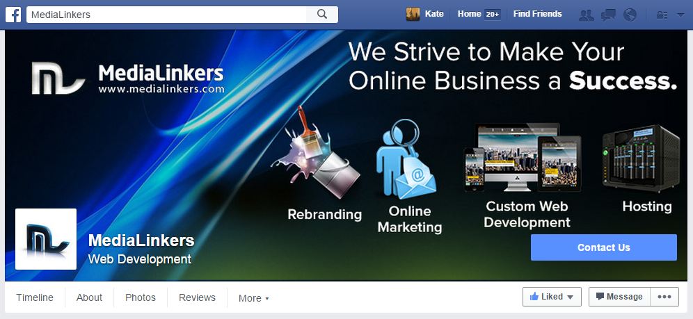
1) Big Backgrounds with a Small Profile Picture
If you look closely, you would notice that in the version, the profile image is smaller and is contained within the background image, instead of being stuck over the 2. As a result, the emphasis is more on the background and less on the profile image.
The change looks in-line with the Facebook’s focus on the image-based content. However, the entire layout of your page would now depend on the background image that you would be using.
2) More Emphasis on the Cover Picture
Also, you would have to create a visually attractive cover. In case your profile picture and the cover image gel well together, you would have to update them, as you can see for yourself from the Coca-Cola business page example. (The straw is not coming out from the bottle as it was previously).
before

After:
3) Page Tabs, Page Title and Category
All the Page tabs are now left aligned, just below the main image, giving a cleaner, functional and a nicer look to the entire layout. Even though, this is a very slight change, but it has provided a new and a modern look to the entire page. In addition, more focus is now on the page ‘Like’ and ‘Share’ buttons, thus providing all the important engaging options in one solid stream.
The page title and the category are also made smaller similar to the profile picture, for emphasizing the cover image. This means that if you have never put a lot of thought into your background image before, you should start thinking seriously about it and upload the one that can make your brand stand out.
4) The CTA Button
The CTA button is also appearing in different locations for different users. From what we have seen, it could be a part of Facebook to test which page location is the best for generating high responses. In the social media examiner page, the CTA button is integrated with the cover image, highlighting it against the background. However, the other users have reported seeing it on the left side of the page, just below the page tabs and the profile images.
Also, the new layout is not yet available to some users, for example in the case of the social media examiner page. So for now it’s not known as to when you should have your profile and the background images integrated. This is because if most of the users are viewing the old version of the page, then certainly you need to wait for some time to upgrade your page.
The CTA button also appears at a different location on the mobile screens, but this is a part of planning for the large update for the business pages on mobile.
Conclusion
From the changes that Facebook has made, you clearly need to focus on the CTA, background cover and the profile image for the business page to get more user attention.
You can also contact the professional graphic design team of Medialinkers to design stylish and trendy background covers for your Facebook Business Page.
Copyright © 2002 - 2025 Multi-Tech MediaLinkers, LLC. All Rights Reserved


