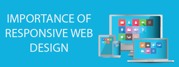
Trends of Responsive Web Design (Info-graphics)
Jobs
Trends of Responsive Web Design (Info-graphics)
- 28 Jul 2015
With the help of responsive web designing, you can have a website built across all the latest smartphone devices, regardless of what the size of the device’s screen it would be viewed on. The responsive web design is focused on providing a gratifying and intuitive experience for everyone. This means that whether you are a mobile or a desktop user, you can benefit from it at all costs.
This is simply because of the several benefits that are attached with the responsive web designs, such as 5 out of 4 smartphone users use it for online shopping. Also, users prefer the sites that are viewed easily on their smartphones and other smart devices compared to the ones that are only easily navigable on the desktops.
Knowing Adaptive vs Responsive vs Mobile
Even though for a lot of people, the term responsive web design is not new, there are other people who are more acquainted with the mobile and adaptive web design term. This will make you wonder what the difference really is between all these designs.
Well, the adaptive and the responsive web designs are related closely and is most of the time transposed as one in the same way. They are also a great means of reacting quickly and in a user-friendly way, according to the screen size. While the responsive web designs are based on different factors and viewport widths, the adaptive sites are built for grouping the preset factors. The two of them are ideal for offering a perfect formula for the functional sites.
The "Responsive Web Design Info-graphics" has been compiled and developed by Medialinkers

Copyright © 2002 - 2026 Multi-Tech MediaLinkers, LLC. All Rights Reserved